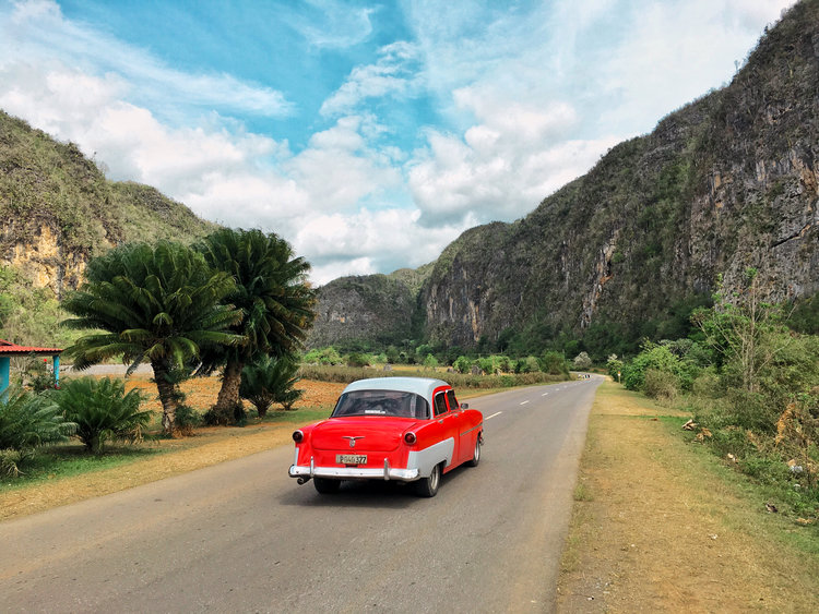
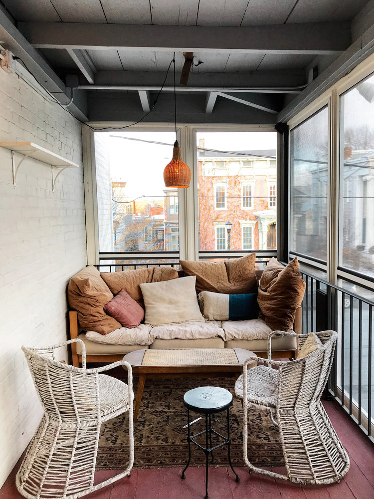
Welcome to image alignment! The best way to demonstrate the ebb and flow of the various image positioning options is to nestle them snuggly among an ocean of words. Grab a paddle and let’s get started.
Large Images – No Captions
The rest of this paragraph is filler for the sake of seeing the text wrap around a left aligned image. As you can see there should be some space above, below, and to the left of the image. The text should not be creeping on the image.
Creeping is just not right. Images need breathing room too. Let them speaklike you words. As you can see there should be some space above, below, and to the left of the image. The text should not be creeping on the image. Creeping is just not right. Images need breathing room too. Let them speak like you words.
Don’t let anyone else tell you differently. In just a bit here, you should see the text start to wrap below the left aligned image and settle in nicely. There should still be plenty of room and everything should be sitting pretty. Yeah… Just like that. It never felt so good to be right.Let them do their jobs without any hassle from the text. In about one more sentence here, we’ll see that the text moves from the right of the image down below the image in seamless transition.
Let them do their jobs without any hassle from the text. In about one more sentence here, we’ll see that the text moves from the right of the image down below the image in seamless transition.
The rest of this paragraph is filler for the sake of seeing the text wrap around a right aligned image. As you can see there should be some space above, below, and to the left of the image. The text should not be creeping on the image.
And now we’re going to shift things to the center align. Again, there should be plenty of room above, below, and to the right of the image. Just look at him there… Hey guy! Way to rock that left side. I don’t care what the right aligned image says, you look great:
Don’t let anyone else tell you differently. In just a bit here, you should see the text start to wrap below the left aligned image and settle in nicely. There should still be plenty of room and everything should be sitting pretty. Yeah… Just like that. It never felt so good to be right.
above, below, and to the right of the image. Just look at him there… Hey guy! Way to rock that left side. I don’t care what the none aligned image says, you look great
Don’t let anyone else tell you differently. In just a bit here, you should see the text start to wrap below the left aligned image and settle in nicely. There should still be plenty of room and everything should be sitting pretty. Yeah… Just like that. It never felt so good to be right.
Large Images – With Captions
The rest of this paragraph is filler for the sake of seeing the text wrap around a left aligned image. As you can see there should be some space above, below, and to the left of the image. The text should not be creeping on the image.
Creeping is just not right. Images need breathing room too. Let them speaklike you words. As you can see there should be some space above, below, and to the left of the image. The text should not be creeping on the image. Creeping is just not right. Images need breathing room too. Let them speak like you words.
Don’t let anyone else tell you differently. In just a bit here, you should see the text start to wrap below the left aligned image and settle in nicely. There should still be plenty of room and everything should be sitting pretty. Yeah… Just like that. It never felt so good to be right.Let them do their jobs without any hassle from the text. In about one more sentence here, we’ll see that the text moves from the right of the image down below the image in seamless transition.
Let them do their jobs without any hassle from the text. In about one more sentence here, we’ll see that the text moves from the right of the image down below the image in seamless transition.
The rest of this paragraph is filler for the sake of seeing the text wrap around a right aligned image. As you can see there should be some space above, below, and to the left of the image. The text should not be creeping on the image.
Creeping is just not right. Images need breathing room too. Let them speaklike you words. As you can see there should be some space above, below, and to the left of the image. The text should not be creeping on the image. Creeping is just not right. Images need breathing room too. Let them speak like you words.
Don’t let anyone else tell you differently. In just a bit here, you should see the text start to wrap below the left aligned image and settle in nicely. There should still be plenty of room and everything should be sitting pretty. Yeah… Just like that. It never felt so good to be right.Let them do their jobs without any hassle from the text. In about one more sentence here, we’ll see that the text moves from the right of the image down below the image in seamless transition.
Creeping is just not right. Images need breathing room too. Let them speaklike you words. As you can see there should be some space above, below, and to the left of the image. The text should not be creeping on the image. Creeping is just not right. Images need breathing room too. Let them speak like you words.
And now we’re going to shift things to the center align. Again, there should be plenty of room above, below, and to the right of the image. Just look at him there… Hey guy! Way to rock that left side. I don’t care what the right aligned image says, you look great:
Don’t let anyone else tell you differently. In just a bit here, you should see the text start to wrap below the left aligned image and settle in nicely. There should still be plenty of room and everything should be sitting pretty. Yeah… Just like that. It never felt so good to be right.
above, below, and to the right of the image. Just look at him there… Hey guy! Way to rock that left side. I don’t care what the none aligned image says, you look great
Don’t let anyone else tell you differently. In just a bit here, you should see the text start to wrap below the left aligned image and settle in nicely. There should still be plenty of room and everything should be sitting pretty. Yeah… Just like that. It never felt so good to be right.
And that’s a wrap, yo! You survived the tumultuous waters of alignment. In just a bit here, you should see the text start to wrap below the right aligned image and settle in nicely. There should still be plenty of room and everything should be sitting pretty.
Galleries
Thumbnail Grid let anyone else tell you differently. In just a bit here, you should see the text start to wrap below the left aligned image and settle in nicely. There should still be plenty of room and everything should be sitting pretty. Yeah… Just like that. It never felt so good to be right.
Masonry and that’s a wrap, yo! You survived the tumultuous waters of alignment. In just a bit here, you should see the text start to wrap below the right aligned image and settle in nicely. There should still be plenty of room and everything should be sitting pretty.
Slideshow now we’re going to shift things to the left align. Again, there should be plenty of room above, below, and to the right of the image. Just look at him there… Hey guy! Way to rock that left side. I don’t care what the right aligned image says, you look great.
Don’t let anyone else tell you differently. In just a bit here, you should see the text start to wrap below the left aligned image and settle in nicely. There should still be plenty of room and everything should be sitting pretty. Yeah… Just like that. It never felt so good to be right.
And that’s a wrap, yo! You survived the tumultuous waters of alignment. In just a bit here, you should see the text start to wrap below the right aligned image and settle in nicely. There should still be plenty of room and everything should be sitting pretty.
Images Inside Paragraphs
And now we’re going to shift things to the left align. Again, there should be plenty of room above, below, and to the right of the image. Just look at him there… Hey guy! Way to rock that left side. I don’t care what the right aligned image says, you look great.
The rest of this paragraph is filler for the sake of seeing the text wrap....around a right aligned image. As you can see there should be some space above, below, and to the left of the image. The text should not be creeping on the image. Creeping is just not right. Images need breathing room too. Let them speaklike you words. As you can see there should be some space above, below, and to the left of the image. The text should not be creeping on the image. Creeping is just not right. Images need breathing room too. Let them speak like you words.
Don’t let anyone else tell you differently. In just a bit here, you should see the text start to wrap below the left aligned image and settle in nicely. There should still be plenty of room and everything should be sitting pretty. Yeah… Just like that. It never felt so good to be right.Let them do their jobs without any hassle from the text. In about one more sentence here, we’ll see that the text moves from the right of the image down below the image in seamless transition.
The rest of this paragraph is filler for the sake of seeing the text wrap....around a right aligned image. As you can see there should be some space above, below, and to the left of the image. The text should not be creeping on the image.
Let them do their jobs without any hassle from the text. In about one more sentence here, we’ll see that the text moves from the right of the image down below the image in seamless transition.
And now we’re going to shift things to the left align. Again, there should be plenty of room above, below, and to the right of the image. Just look at him there… Hey guy! Way to rock that left side. I don’t care what the right aligned image says, you look great.
Don’t let anyone else tell you differently. In just a bit here, you should see the text start to wrap below the left aligned image and settle in nicely. There should still be plenty of room and everything should be sitting pretty. Yeah… Just like that. It never felt so good to be right.
List of small images, aligned left:
And that’s a wrap, yo! You survived the tumultuous waters of alignment. In just a bit here, you should see the text start to wrap below the right aligned image and settle in nicely. There should still be plenty of room and everything should be sitting pretty.
And now we’re going to shift things to the left align. Again, there should be plenty of room above, below, and to the right of the image. Just look at him there… Hey guy! Way to rock that left side. I don’t care what the right aligned image says, you look great.
Small Images Inside Paragraphs
And now we’re going to shift things to the left align. Again, there should be plenty of room above, below, and to the right of the image. Just look at him there… Hey guy! Way to rock that left side. I don’t care what the right aligned image says, you look great.
The rest of this paragraph is filler for the sake of seeing the text wrap....around a right aligned image. As you can see there should be some space above, below, and to the left of the image. The text should not be creeping on the image. Creeping is just not right. Images need breathing room too. Let them speaklike you words. As you can see there should be some space above, below, and to the left of the image. The text should not be creeping on the image. Creeping is just not right. Images need breathing room too. Let them speak like you words.
Don’t let anyone else tell you differently. In just a bit here, you should see the text start to wrap below the left aligned image and settle in nicely. There should still be plenty of room and everything should be sitting pretty. Yeah… Just like that. It never felt so good to be right.Let them do their jobs without any hassle from the text. In about one more sentence here, we’ll see that the text moves from the right of the image down below the image in seamless transition.
The rest of this paragraph is filler for the sake of seeing the text wrap....around a right aligned image. As you can see there should be some space above, below, and to the left of the image. The text should not be creeping on the image.
Let them do their jobs without any hassle from the text. In about one more sentence here, we’ll see that the text moves from the right of the image down below the image in seamless transition.
And now we’re going to shift things to the left align. Again, there should be plenty of room above, below, and to the right of the image. Just look at him there… Hey guy! Way to rock that left side. I don’t care what the right aligned image says, you look great.
Don’t let anyone else tell you differently. In just a bit here, you should see the text start to wrap below the left aligned image and settle in nicely. There should still be plenty of room and everything should be sitting pretty. Yeah… Just like that. It never felt so good to be right.Let them do their jobs without any hassle from the text. In about one more sentence here, we’ll see that the text moves from the right of the image down below the image in seamless transition.
The rest of this paragraph is filler for the sake of seeing the text wrap....around a right aligned image. As you can see there should be some space above, below, and to the left of the image. The text should not be creeping on the image.
Let them do their jobs without any hassle from the text. In about one more sentence here, we’ll see that the text moves from the right of the image down below the image in seamless transition.
And now we’re going to shift things to the left align. Again, there should be plenty of room above, below, and to the right of the image. Just look at him there… Hey guy! Way to rock that left side. I don’t care what the right aligned image says, you look great.


